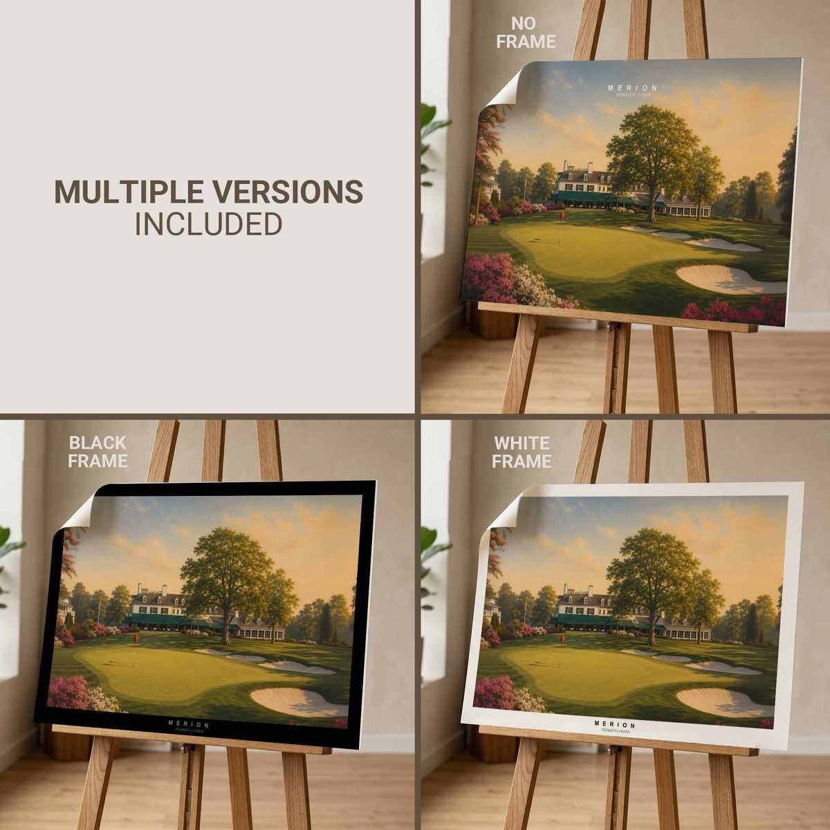
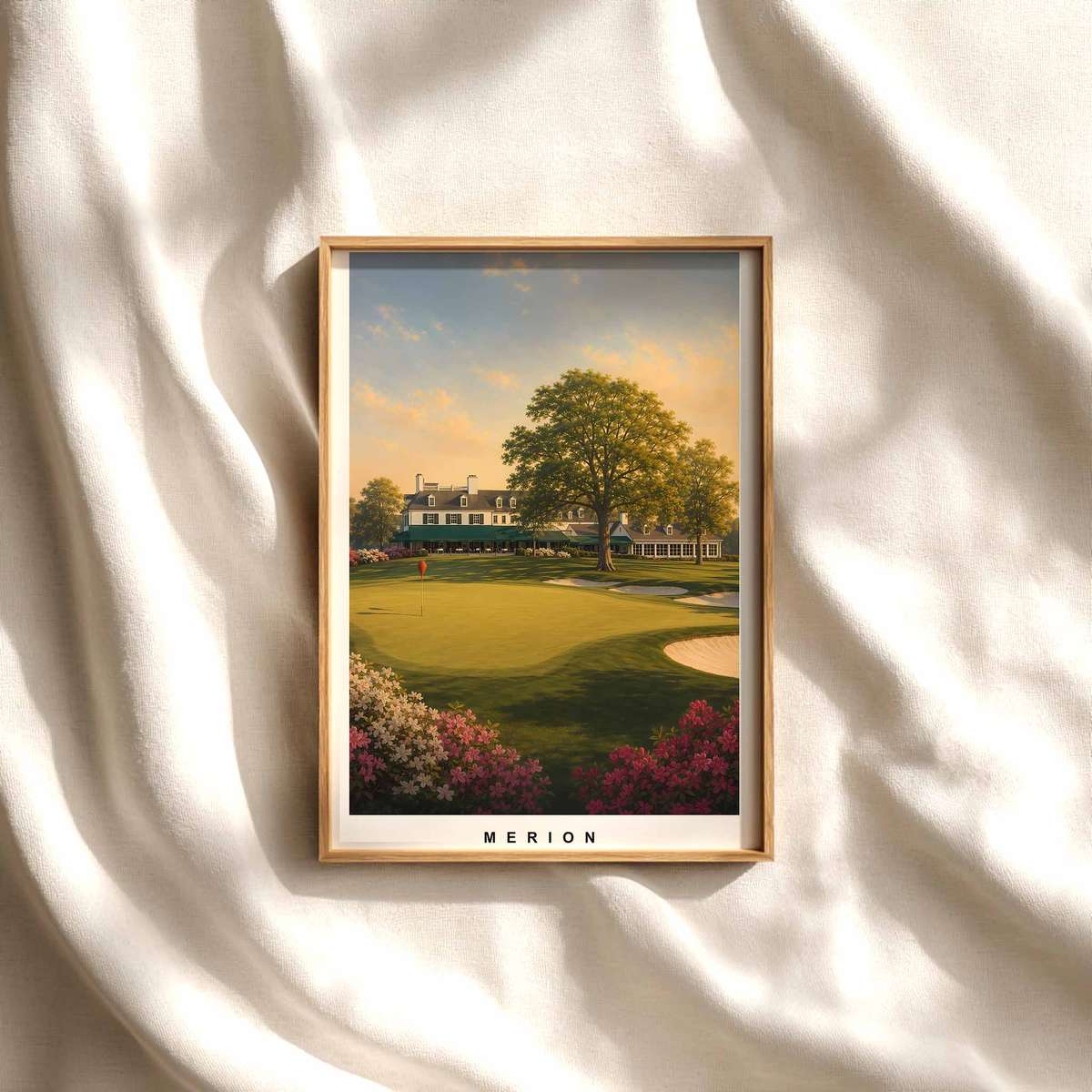
The image reads like a study in measured restraint: a single golfer, compact in scale against the soft sweep of Merion East, becomes the axis around which every compositional choice turns. This is golf imagery that trusts absence as much as presence. Rather than crowding the scene with trophies, crowds or ornate detail, the poster allows posture, simple props and muted space to do the talking—an approach that feels especially suited to considered gifts and decor like golf stuff for dad.
At the centre is the figure: not a celebrity frozen in triumph but a person whose stance and ritual supply the drama. The body’s weight transfer, the slight bend of the knees, the set of the shoulders and the quiet angle of the club together describe a moment of calm preparation. Those sober, exact lines of posture read cleanly from a distance, giving the artwork an immediate visual grammar—silhouette first, nuance second. For a wall piece, that economy of shape is a virtue: it anchors the eye without shouting for attention.
The poster’s scale is intimate, and that intimacy is amplified by small, evocative details. Wicker baskets on the sidelines, a hint of manicured turf, and the muted palette suggest vintage leisure and a long habit of play. These elements act as cultural shorthand—signs of an older, slower game—without resorting to kitsch. The wicker, in particular, introduces texture and domestic warmth; it tells you this is an environment of careful rituals rather than spectacle, which is precisely why the image feels rare and collectible rather than generic.
[IMAGE_INSERT_ARTICLE_01]
Visually, restraint is the poster’s defining quality. Negative space frames the figure so that every line of the swing—pre-shot focus, club axis, follow-through potential—reads like calligraphy. That spatial modesty gives the image its distinction: the eye is invited to linger on posture and rhythm rather than being led by bright color or frenetic detail. The result is an artwork that communicates composure: a held breath before impact, a practiced cadence, the quiet mathematics of balance and intent.
This focused human presence also shapes the mood the work brings into a room. In a study or den, the poster suggests concentration and ritual—qualities associated with measured decision-making and quiet afternoons. In a living room or hallway it reads as an elegant conversation piece: not loudly nostalgic, but thoughtfully historic. For someone shopping golf stuff for dad, that emotional clarity makes the poster an unusually considerate choice; it projects memory and routine rather than fanfare.
Beyond mood, the image functions as a lesson in visual hierarchy. The golfer’s posture does the narrative work: head slightly down, hands composed, spine aligned—these cues tell the beholder where to look and how to feel. The spectator is positioned to appreciate the craft of stance and the discipline of practice. In practical terms this means the artwork rewards repeated viewing; each glance reveals another small facet of balance or intent.
Finally, the poster’s heritage-led design language—muted tones, minimal type or none at all, and restrained ornament—allows it to pair easily with refined interiors. It complements leather-bound books, walnut frames and rooms where objects are chosen with patience. The piece doesn’t demand a specific decor; instead it elevates quiet spaces by introducing a human rhythm that feels both private and composed.
Author:

 ↧ Digital download
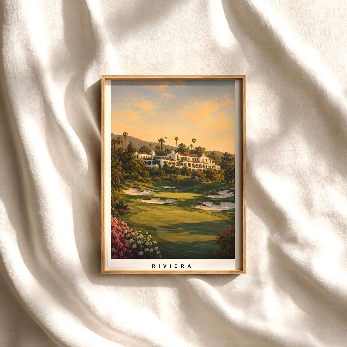
Riviera Swing Moment — Golf Poster Art That Captures Balance...
Digital download
↧ Digital download
Riviera Swing Moment — Golf Poster Art That Captures Balance...
Digital download
 ↧ Digital download
Pinehurst No. 2: The Elegant Austerity of a Golf Course Print
Digital download
↧ Digital download
Pinehurst No. 2: The Elegant Austerity of a Golf Course Print
Digital download
 ↧ Digital download
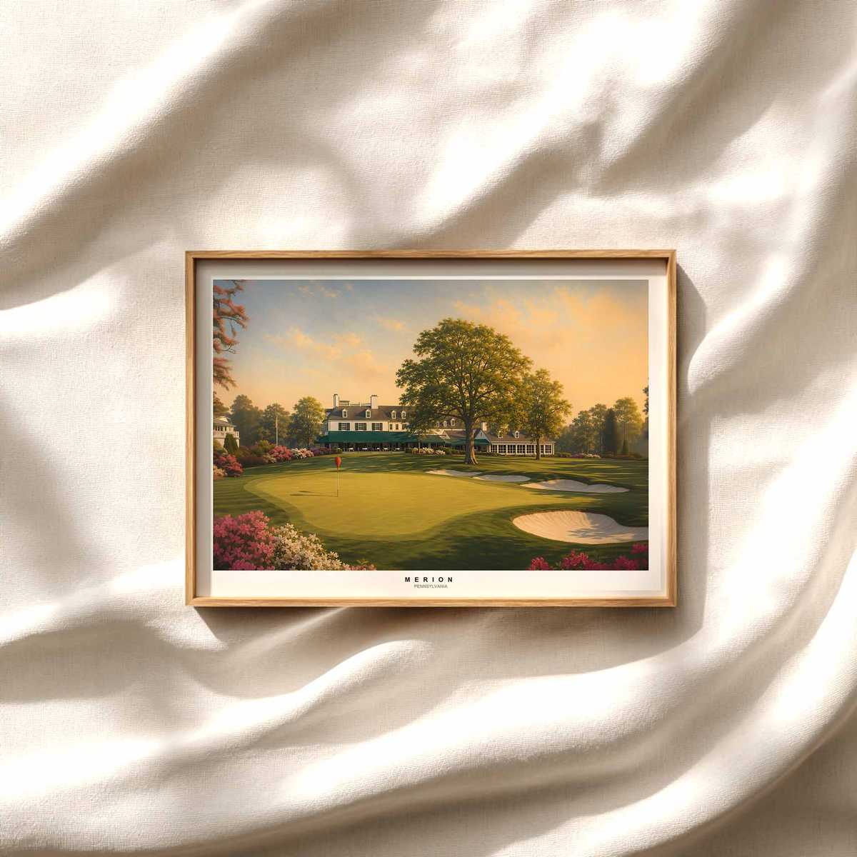
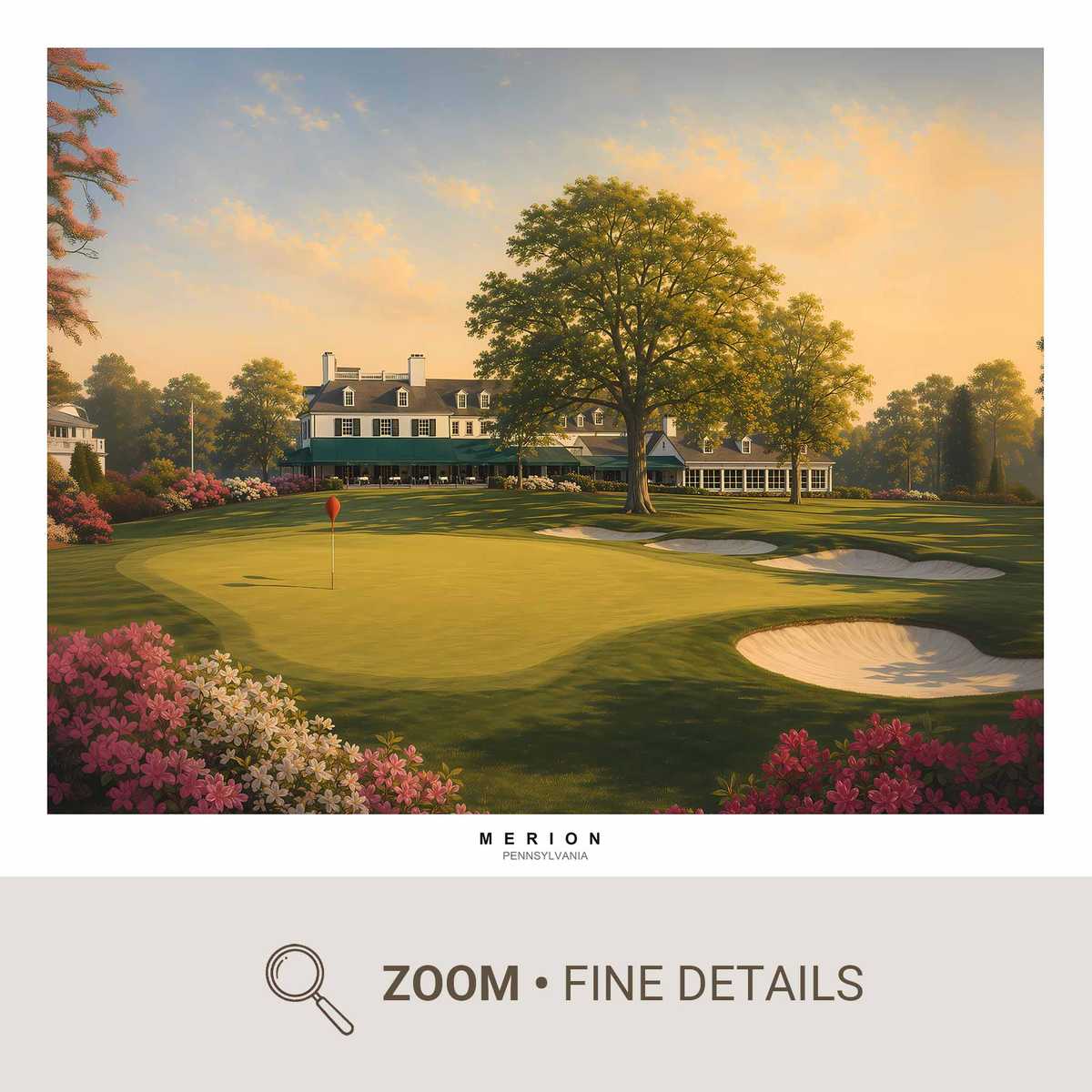
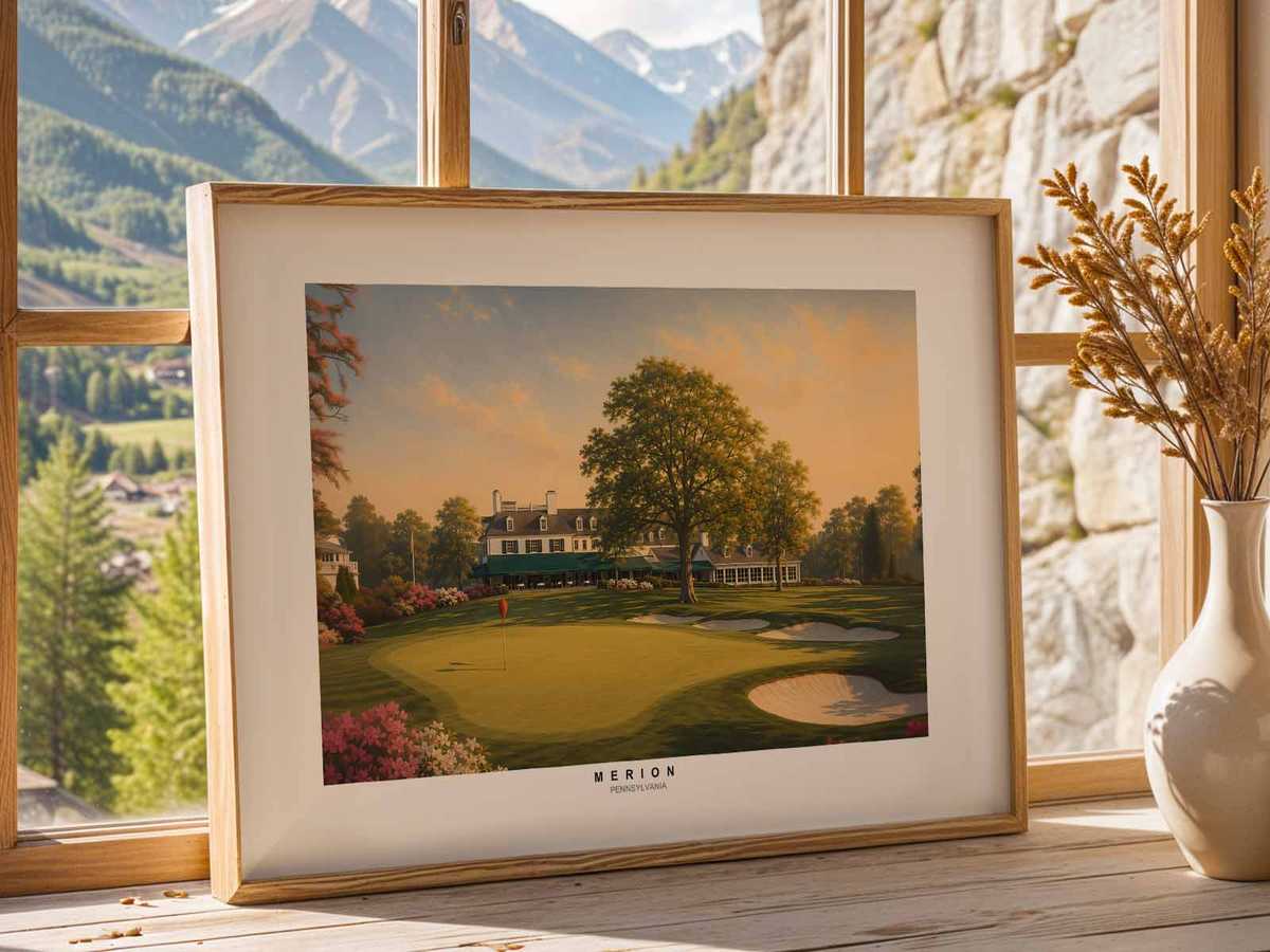
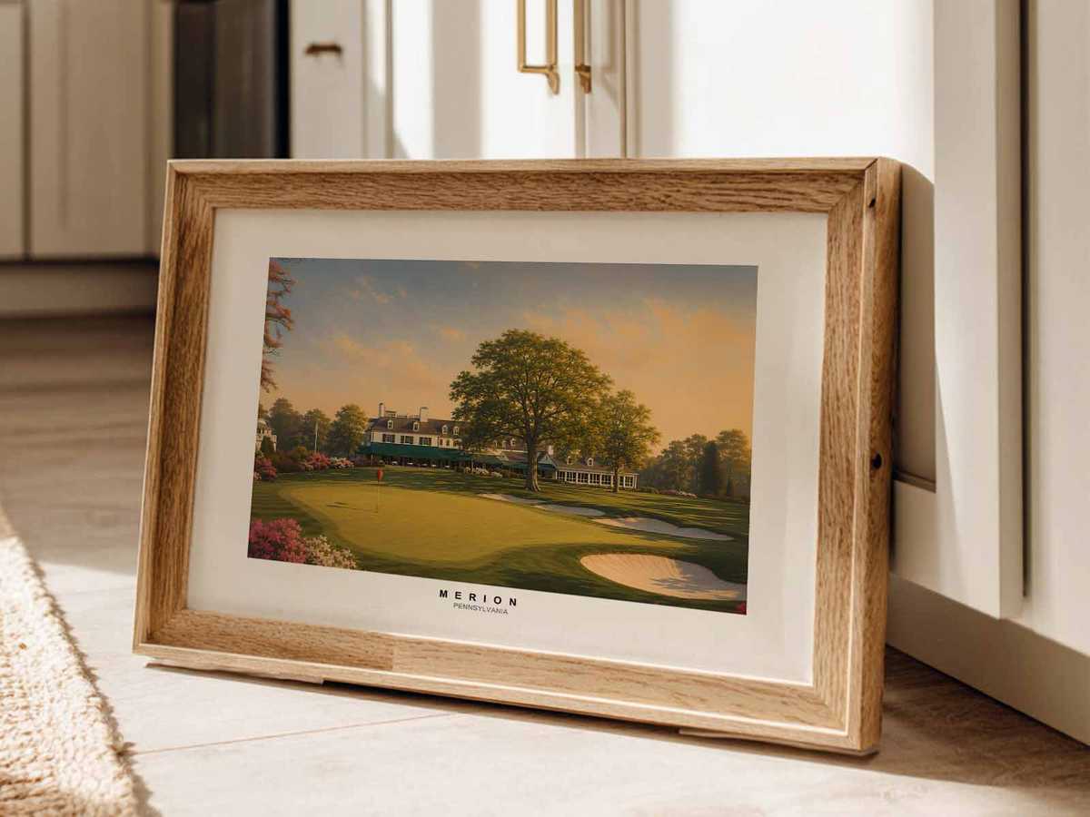
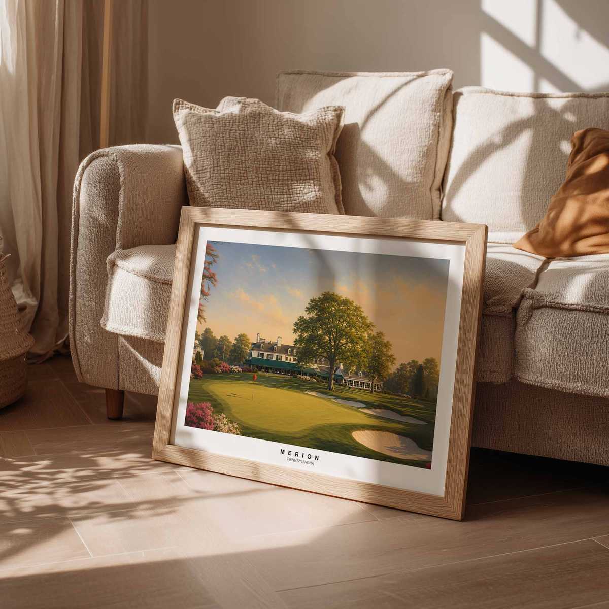
Merion East: Quiet Golf Art for the Study, Clubhouse and Gentleman's...
Digital download
↧ Digital download
Merion East: Quiet Golf Art for the Study, Clubhouse and Gentleman's...
Digital download
 ↧ Digital download
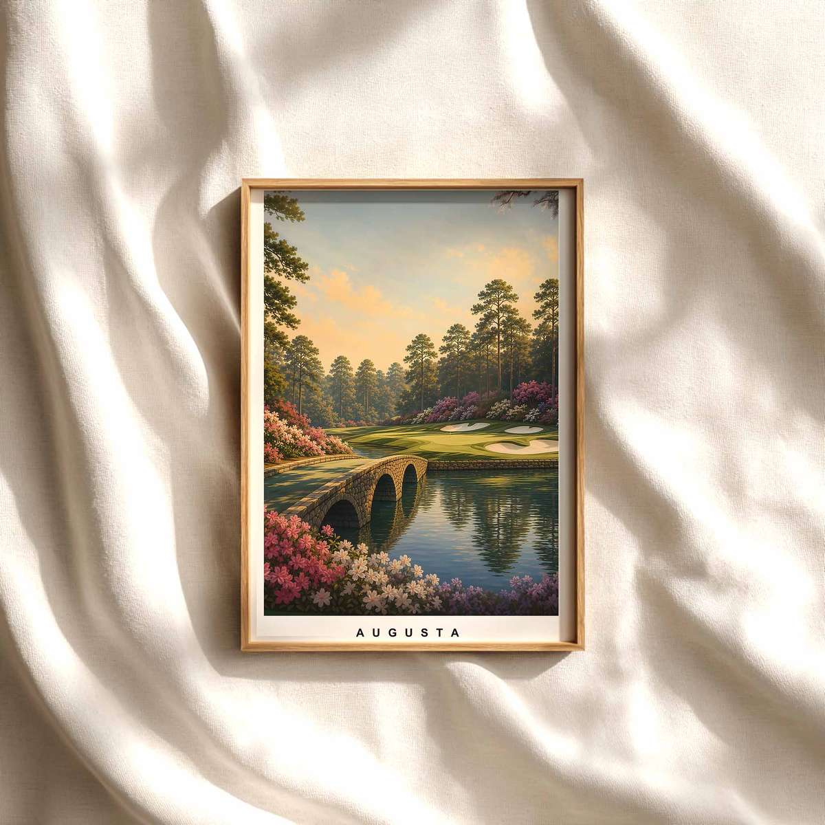
Golf Gift for Men: Augusta National–Style Player Poster as Elegant...
Digital download
↧ Digital download
Golf Gift for Men: Augusta National–Style Player Poster as Elegant...
Digital download