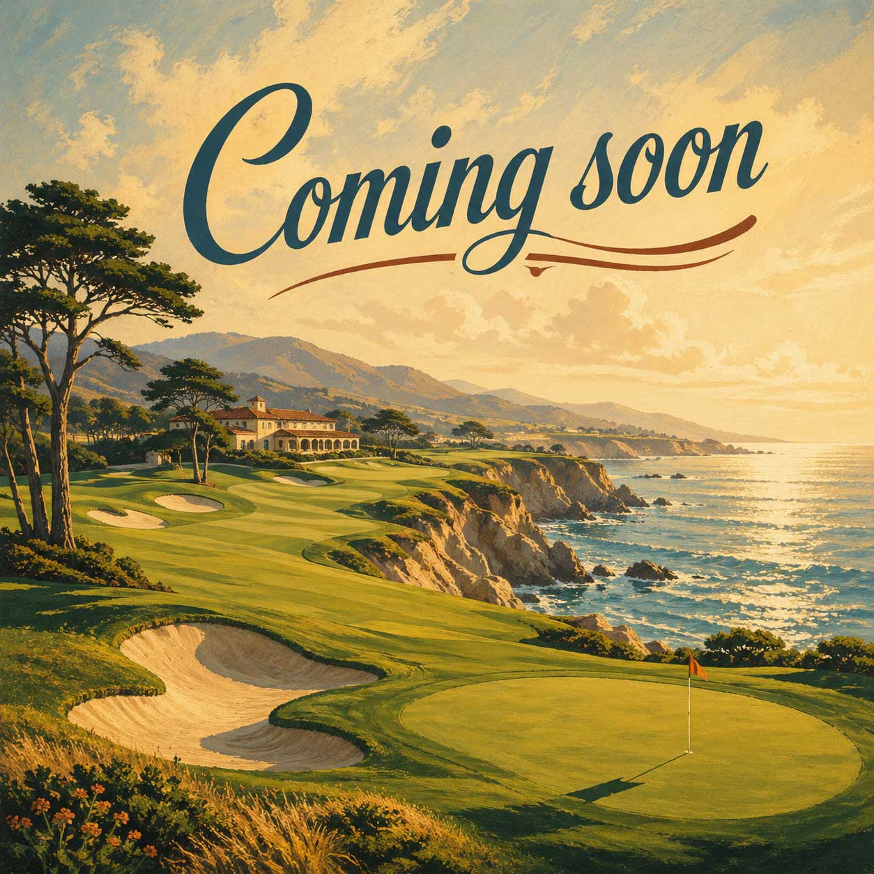
There is a rare kind of golf image that arrives not as drama but as place: an ordered landscape that reads perfectly at a distance, that quiets a room simply by being there. The poster interpretation of Royal Lytham & St Annes works precisely this way. At first glance the land seems flat, honest and undecorated; looked at longer, it reveals a choreography of subtle rises, wind-sculpted grass and a lattice of bunkers that give the scene its spine. This is not a portrait of play but an exercise in atmosphere — a study in how restraint becomes presence.
The most striking feature is how the omnipresent bunkers function as graphic punctuation. In print they read like charcoal marks across a pale field, creating rhythm and tension without noise. Their edges catch light differently from the fairway and green planes, producing discreet contrast that holds the eye and suggests depth where the land might otherwise appear flat. This economy of form makes the image friendly to interiors: it is decorative because it is composed, and calming because it is deliberate.
Light plays a quiet role. In the poster version the sky is often a soft, cool wash that lets horizon lines and subtle hollows assert themselves. Shadows are not theatrical; they are measured, offering just enough modelling to separate surfaces and to imply distance. The overall effect is a moderate palette and a steady atmosphere — a kind of visual hush that reads well above a mantelpiece or behind a study desk. The image becomes a window rather than a scene of action.
[IMAGE_INSERT_ARTICLE_01]
Texture and green tone are handled with restraint. Close inspection reveals the grain of the turf, the clipped cadence of fairway stripes and the velvet of a putting surface, yet none of these details shout. Instead they combine to form a layered stillness: foreground turf leads to midground bunkers and then to the receding sweep of the course, offering depth that hangs on the wall like a composed photograph. That sense of distance — a measured vanishing — is what gives the print real mural weight in a room.
Why does a course image like this work so naturally in refined interiors? First, it supplies order. The course’s routing and the repetition of sculpted hazards set a visual rhythm akin to pattern in textile or architecture; that rhythm stabilizes a space. Second, the absence of people and movement invites contemplation rather than spectacle. The poster is not asking to be read for a moment-by-moment narrative but to be inhabited slowly, day after day, as a calming presence.
In practical terms, the print pairs well with neutral palettes and tactile materials — raw oak, linen and stone — because its tonal restraint complements rather than competes. In a study it becomes a focus that encourages thought; in a living room it offers a quiet confidence; in a golf room it confirms a deeper appreciation for landscape over highlight reel. It’s an image that ages well because its appeal is architectural and atmospheric, not trendy.
Ultimately, this poster of Royal Lytham & St Annes is successful because it treats the course as a landscape of intent. The flatness is deceptive; the bunkers supply narrative, the light keeps everything modest, and the overall restraint becomes the principal statement. For anyone seeking golf present ideas that respect a calm interior and reward repeated looking, this image delivers a true wall presence — serene, layered and quietly commanding.