This poster reads less like a souvenir and more like a recovered page from golf's visual memory. The dominant image is the landscape itself — the furrowed fairway, the low horizon and the clubhouse forms suggested as silhouettes — treated through a restrained, vintage design language where small irregularities and a deliberately weathered surface become evidence of patina rather than damage. That patina, the careful unevenness in tone and the graphic rhythm of the composition, is what turns the scene into an argument for tradition: the image insists that place and ritual matter.
Visually the print favours economy. A muted palette — softened ochres, washed greens and coal greys — gives the poster a twilight calm. Typography (if present) uses serif letterforms or period cues set with generous margins; both type and image breathe at the same pace. These decisions are not decorative afterthoughts but the grammar of heritage: spacing, restraint and the echo of older printing techniques coax the eye into a different mode of looking, one that privileges memory and quiet esteem over novelty or spectacle.
Where a contemporary golf poster might dramatise motion, this image privileges the traces motion leaves behind: the worn path, the line of bunkers, a solitary flag leaning into the wind. Those visual 'railways' — compositional lines that guide the eye across dunes and through sky — function like a collector's map. They invite the viewer to travel slowly across the scene, to register small imperfections, the grain of printed paper and the subtle halftone textures that imply an earlier hand. The result reads as both décor and document: a picture that holds atmosphere rather than merely illustrating a sport.
[IMAGE_INSERT_ARTICLE_01]
That delicious oddness — a slightly off-register print layer, an unexpected colour halo, a margin that suggests manual cropping — is central to the poster's charm. These are not flaws to be masked but signals of authenticity in aesthetic intention. For a buyer thinking of a golf gift basket, such an artwork contributes more than surface nostalgia; it offers a considered object that complements leather-bound books, a wood-trimmed office, or the quiet geometry of a study lined with maps and trophies. The poster does not shout; it furnishes a room with a mood, a quiet confidence rooted in continuity.
Collectors value continuity: the sense that an image participates in a lineage of taste. Here that lineage is visible in the composition's ritual economy — in the way human presence is implied rather than foregrounded, in the preference for landscape over celebrity, and in the selective use of period graphic language. A framed copy sits naturally above a mantel, beside a reading lamp, or within a gallery-like arrangement of travel prints because it offers a calm counterpoint to brighter, more immediate visual material. It rewards slow looking and repeated acquaintance.
Finally, the poster's appeal as wall art lies in how tradition is translated into visual habit. It asks the viewer to accept visual irregularity as part of meaning, to read weathered texture as memory, and to let compositional restraint evoke prestige rather than proclaim it. For anyone assembling a thoughtful golf gift basket or curating a heritage-inspired interior, this image supplies a rare quality: it feels like an heirloom before it becomes an object on a wall.


 ↧ Digital download
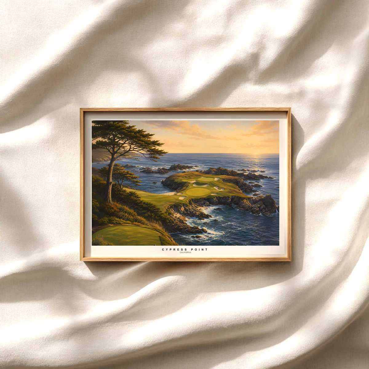
Cypress Point: The Golfer as a Panoramic Anchor — Golf Gadgets for Dad
Digital download
↧ Digital download
Cypress Point: The Golfer as a Panoramic Anchor — Golf Gadgets for Dad
Digital download
 ↧ Digital download
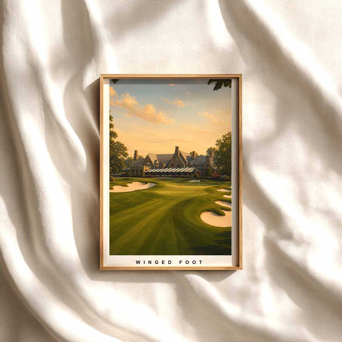
Winged Foot West: Visual Gravity in Golfer-Led Wall Art
Digital download
↧ Digital download
Winged Foot West: Visual Gravity in Golfer-Led Wall Art
Digital download
 ↧ Digital download
Carnoustie: Rugged Elegance — Golfer Poster for Strong Wall Presence
Digital download
↧ Digital download
Carnoustie: Rugged Elegance — Golfer Poster for Strong Wall Presence
Digital download
 ↧ Digital download
Pinehurst No. 2: The Elegant Austerity of a Golf Course Print
Digital download
↧ Digital download
Pinehurst No. 2: The Elegant Austerity of a Golf Course Print
Digital download