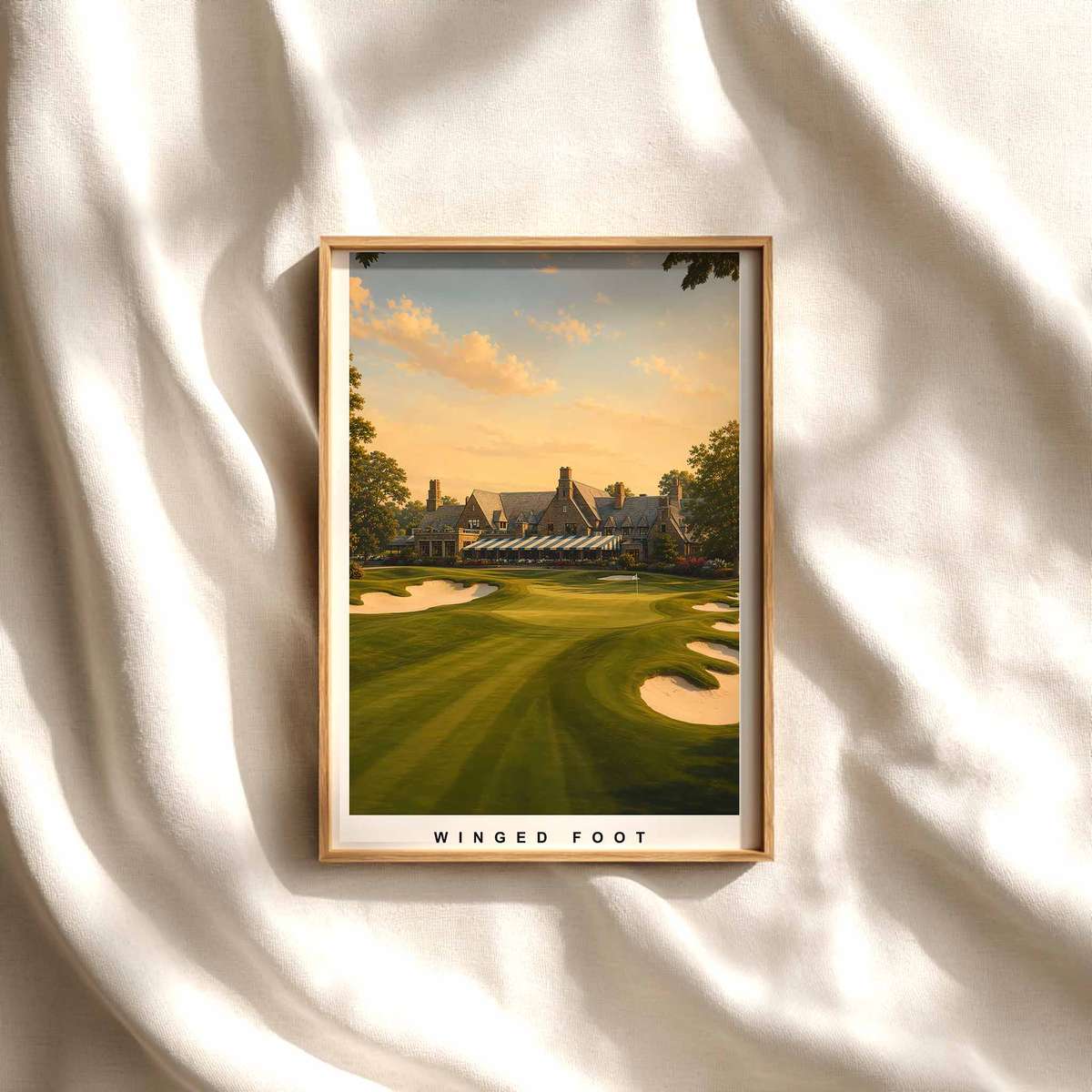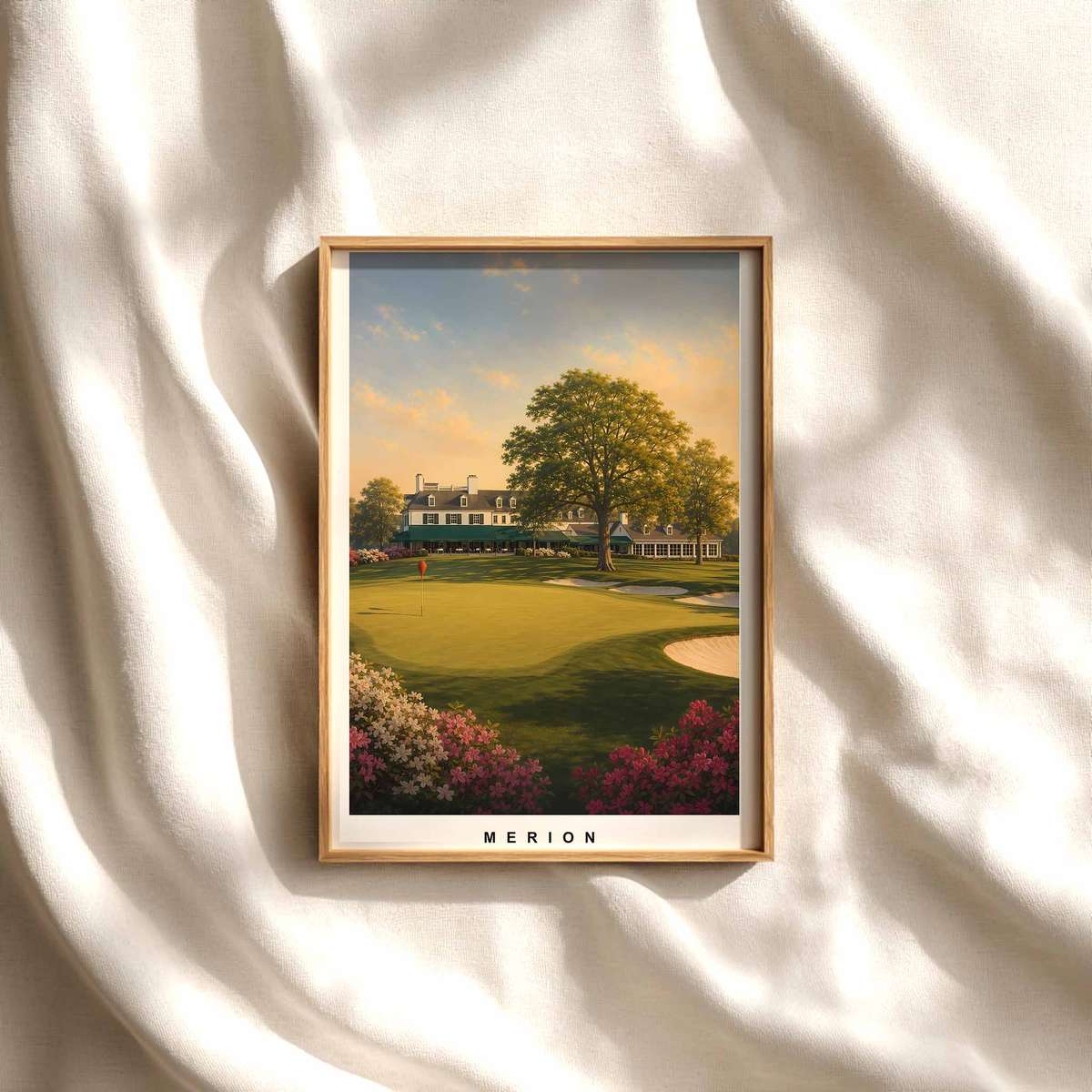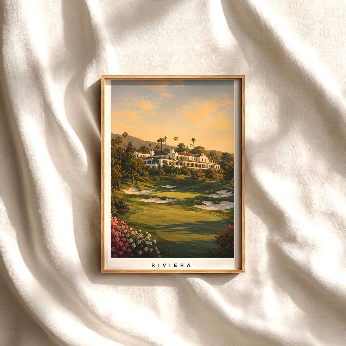
Prestwick in Quiet Light: How a Tenby Poster Brings Classic Golf Tone to a Study
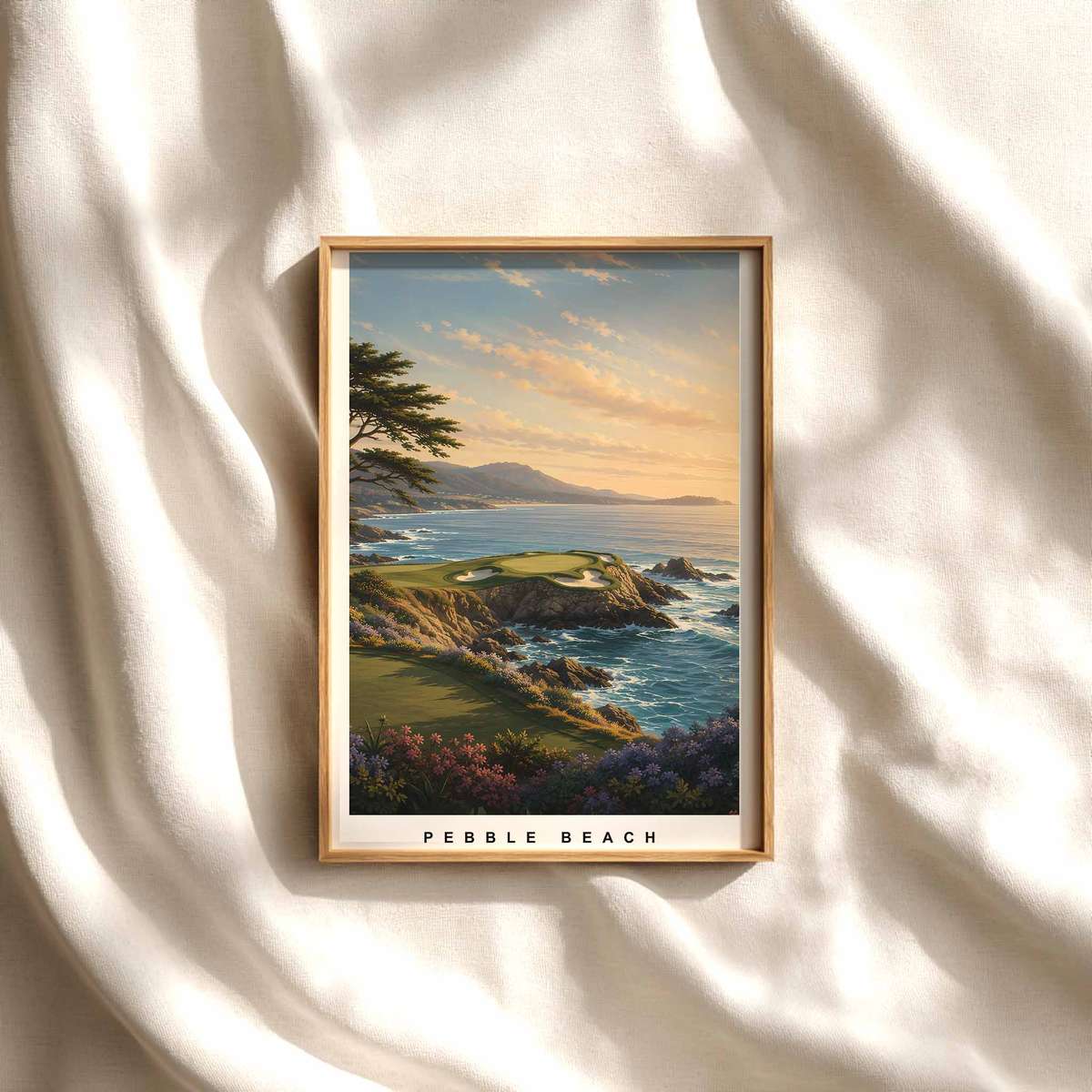
There is a particular hush that arrives when a course image reads less like an action shot and more like a composed room. A poster of Prestwick, framed and mounted above a desk or beside a reading chair, offers that hush: the slow architecture of fairways, the patient irregularities of older ground, and the ordered eccentricity that turns landscape into a contemplative object. This is not about a scorecard or a swing; it is about tonal presence—how light, line and texture combine to inhabit a domestic interior with refined calm.
Prestwick’s character—its ancient hollows, shifted dunes and rouged green contours—translates on a wall as a measured choreography. The eye follows gentle ridges and depressions in a measured way, the visual rhythm of the fairway acting like a quiet metronome. Where manicured sports photography demands movement, here the composition encourages stillness: we notice the grain of the grass, the way a bunker curves like a punctuation, the subtle tonal shifts between sunlit turf and coastal shade. These are the elements that make golf imagery more than decoration; they give it an intellectual ordering that sits comfortably among books and paper.
Light plays a decisive role. In the poster, morning or late-afternoon sun thins across the links, softening contrasts and stretching shadows so that the surface reads as texture rather than information. Distance becomes suggestion—the horizon a pale ribbon that promises space without shouting for attention. This restrained luminosity lets the print act as a quiet anchor in a workspace: it brightens without distracting, invites the eye to rest, and returns the room to a slower tempo. That tempered light is why some course images function as visual punctuation rather than background wallpaper.
The appeal of an old course like Prestwick also rests in its visual surprises. Irregularities—odd mounds, a sudden chute, a clubhouse tucked at an oblique angle—create what might be called a tasteful strangeness. These features refuse tidy symmetry and therefore reward contemplation. They create small narratives within the frame: a path that disappears, a bunker whose lip suggests an untold challenge, a green that tilts toward the sea. In an office setting, such peculiarities offer a mental companion to deep work, a gentle reminder of place and time that is both specific and open to interpretation.
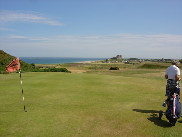
Compositionally, course-led images behave like landscapes of thought. The routing lines—the visual railways of cart paths, ridge lines and fencelines—draw your sight deliberately across the print. That movement is not frantic; it is purposeful. It establishes a map for the eye to follow, creating a private geography that coexists with the room’s function. When placed near shelving or a reading lamp, the poster creates a layered aesthetic: books suggest ideas, the photograph suggests place, and together they form an environment conducive to reflection.
There is also an emotional economy to such images. Without players, scoreboards, or shouting crowds, the scene retains dignity and reserve. The viewer projects narrative into empty tees and greens—the imagined rounds, the remembered walks—without being told what to feel. That open invitation is why golf wall art often feels timeless and civilised: it supplies mood rather than message, tone rather than instruction.
Finally, practical interiors benefit from this temperament. A Prestwick poster complements wood and leather, tempered metals and linen; its palette of muted greens, sandy ochres and coastal greys pairs easily with neutral schemes. It acts as both focal point and companion piece, a work that can be admired in passing or studied at length. In a study or reading nook, the image cultivates calm, supplies a gentle spatial order, and lends the room the rare quality of being both lived-in and deliberately curated.
Author: {Eric M.}